With help from the excellent data team at The Economist, here’s an ‘Olympic medal map’. It is an interactive infographic that provides a daily update on which countries or regions have won what events and what is still to play for.
Infographic developed by Ændrew Rininsland. Daily updates from Kenn Cukier and me.
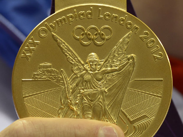
Olympic medal map, The Economist’s Graphic Detail blog, Jul-Aug 2012
Links: Day 1, Day 2, Day 3, Day 4, Day 5, Day 6, Day 7, Day 8, Day 9, Day 10, Day 11, Day 12, Day 13, Day 14, Day 15, Day 16
Image from here.
